UX-Related Preferences and Questions Answered – Table Sorting

Context:
There are plenty of articles outlining “best practices” for table sorting UX. Yet even when those patterns are followed, users often hesitate or misinterpret what’s happening.
So let’s test it ourselves and put some real numbers behind it.
When viewing a table, you’ll often see a sorting icon next to a column header, usually an arrow. Depending on the data, sorting may include:
- Alphabetical (A–Z / Z–A)
- Recency (Newest–Oldest / Oldest–Newest)
- Size (Largest–Smallest / Smallest–Largest)
Results:
Table Sorting UX: What Our Poll Revealed
The results are in. We asked users which visual treatment most clearly communicates how a table is sorted and how to change it. The responses reveal which patterns feel most intuitive and where common sorting indicators may cause hesitation or confusion.
Final tally:
- A. 11 votes for separate up and down arrows, each acting as a distinct sort action.
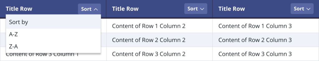
- B. 23 votes for up and down arrows that open a dropdown to choose sort options. 🏆
- C. 11 votes for a single arrow that toggles between up and down states.
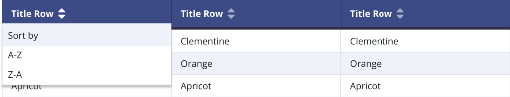
- D. 16 votes for the use of labels or characters to indicate sort order.
The Conclusion:
Option B moderately outperformed Option D, indicating that the clearer and more explicit the sorting method, the better. The recommendation is to use Option B or a hybrid of B and D.
OR