Why Full-Screen Overlays Hurt Your Website (and Your Users)

We’ve all encountered them, full-screen overlays that seemingly take over a website the moment we land on it. While initially intended to capture attention and ensure users see important information like email sign-up forms or discount offers, these aggressive tactics can backfire. Let’s delve into the perils of automatic full-screen overlays and explore better alternatives.
The Illusion of Effectiveness
Marketers often see full-screen overlays as a foolproof way to grab user attention. After all, they literally block the user from accessing the website until they engage with the overlay. However, this tactic often creates frustration rather than engagement. Users feel interrupted in their intended action and may simply abandon the website altogether.

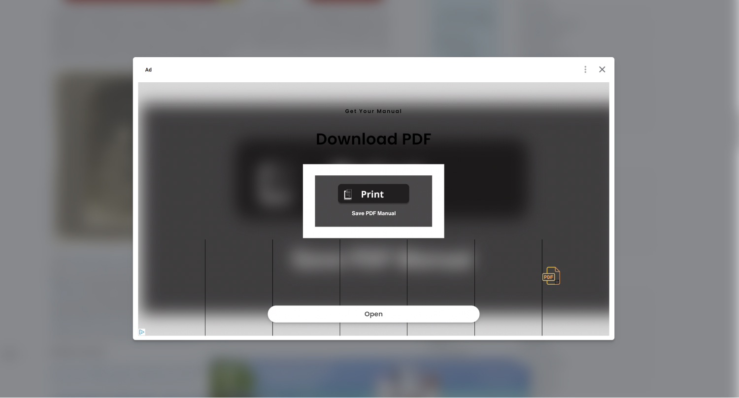
Pop-up ad blocking the user from interacting with the Open Culture website
Collateral Damage: SEO and Accessibility
Beyond user experience, these overlays come with hidden costs:
- SEO Impact: Search engine crawlers rely on the ability to access and understand all website content. Full-screen overlays can obstruct crawlers from indexing your content effectively, potentially harming your website’s search ranking.
- Accessibility Issues: If the overlay doesn’t offer options for users with disabilities to bypass it, such as keyboard navigation or screen reader compatibility, it creates an accessibility barrier, potentially excluding a significant portion of your audience. If it does offer the opportunity to bypass the overlay, a person with disabilities may get trapped behind the modal. Both of these are a huge accessibility violation.
Not All Overlays are Bad
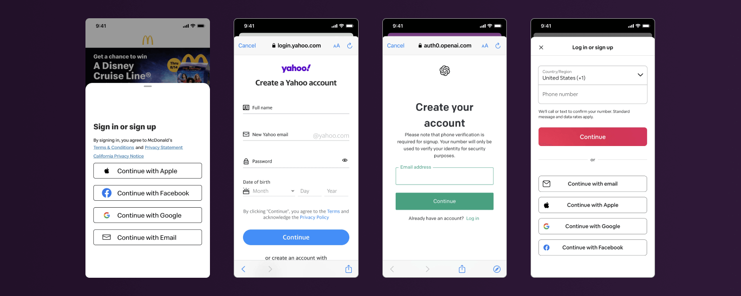
Modals should be used to help users get more context to a specific on-page topic, which in turn keeps the user on the page. Offering additional information through a user activated modal is a great way to reduce tab confusion and keep a user on their intended track. A great example of a user activated modal is when a user adds an item to their cart on their phone where a modal gets brought up with your total checkout price and the option to keep shopping. This allows the user to see their current total while being able to dismiss and continue shopping very quickly without losing the other items in their current view.

Screenshots of various user activated log in and create account overlays featuring McDonald’s, Yahoo, ChatGPT, and Airbnb
Alternatives to the Overlay Onslaught
Fortunately, there are several effective alternatives that achieve similar goals without the negative side effects:
- Fixed Top or Bottom Banners: These banners remain visible throughout the user journey without completely blocking the content.
- Sidebars or Content Panels: These dedicated sections can display relevant information without hindering the user’s primary interaction with the main content area.
- Smart Pop-Ups: Pop-ups triggered by specific user actions, like scrolling past a certain point or clicking a designated button, offer a more targeted and less disruptive approach.
By opting for these alternatives, you’ll be in better shape to make sure your website remains user-friendly, accessible, and SEO-optimized; Ultimately leading to a more positive user experience and potentially better results for your marketing efforts. Remember, respecting your user’s browsing experience is key to building trust and fostering long-term engagement.