Add some texture to your life!
How we got here
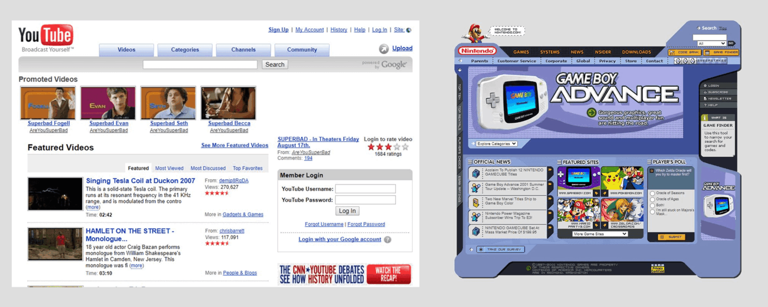
Early UI design leaned into the physical world, felt more real, brushed metal, leather-stitches, harsh paper textures. It wasn’t always the prettiest, but it was fun and had character. Then the flat design trend came and never left, bevel and emboss gone, shadows gone, all texture gone.
It kept getting more and more minimal until we ended up with interfaces that feel more like wireframes than finished products. Now, the most exciting thing is adding a drop shadow to a button or card.
Texture is more than just noisy grain or paper
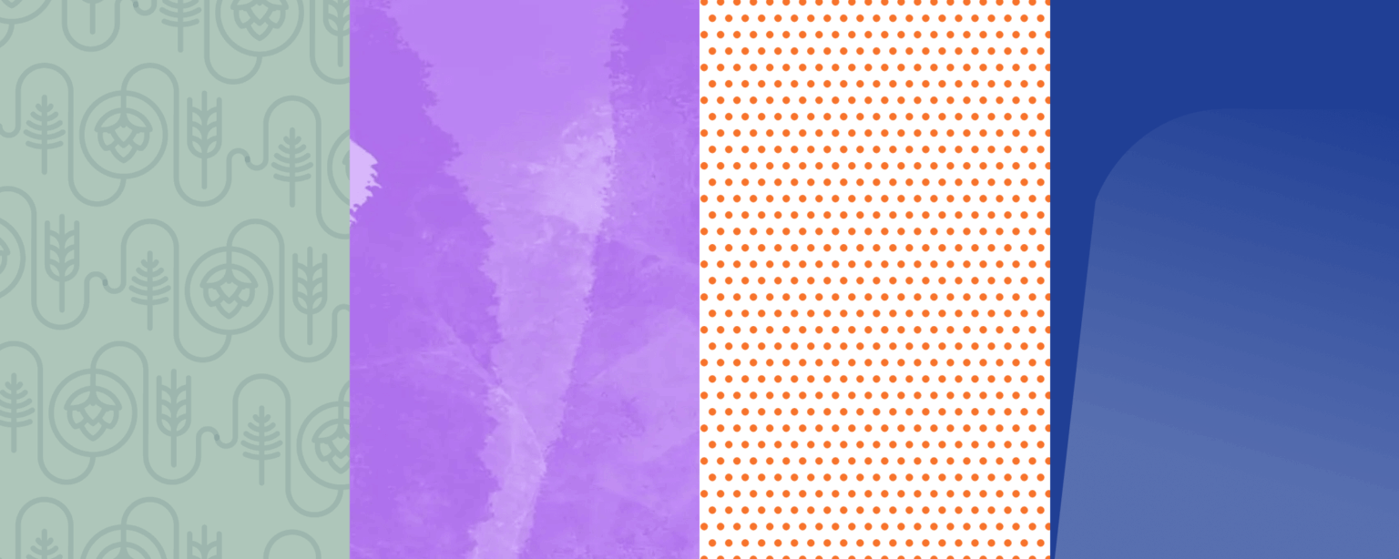
When people hear “texture,” they picture noise overlays, paper grain, linen patterns, etc. Those are great, but they’re not the only type of texture you can try. Texture can be a repeating pattern, a grid of dots, a diagonal stripe with a faded gradient. Even a single shape with a different color on a background breaks up the design and creates some texture.

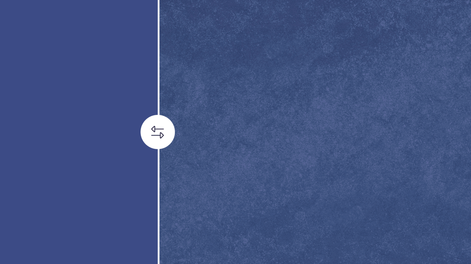
Sample CTA component with a splash of texture.
Texture stops the scroll
Texture in design is just more interesting, and that’s not debatable. When a user is scanning a page full of flat cards and buttons, a single CTA with a noisy grain in the background will grab their attention.
In a world of Claude and ChatGPT designs, that kind of differentiation is worth thinking about. AI-generated design is producing sites that all look the same: the same soft gradients, the same rounded cards, the same hero designs, even the same sans serif typeface (looking at you, Inter and Figtree).
The design is nice, sure, but nothing memorable, they all start blending together. Adding a little bit of texture is an easy way to differentiate your designs and show a human was involved.
You don’t have to overdo it
You don’t need to rebuild your entire design system around texture, or apply texture to every component, try the 80/20 rule.
Sometimes one component is all it takes: a hero section with a grainy gradient, a pathway card with a subtle crosshatch fill, a CTA with a paper background. One textured component on a page of clean ones can really pop on a whole page. These decisions can make a design feel more alive without overwhelming a user.
That said, there’s something to be said for throwing caution to the wind every now and then. Go heavy and see what happens. The worst outcome is you learn exactly where the line is. With design, it’s easier to overdo it then start pulling back, push the limits and find the right amount of texture for your design.
It doesn’t have to make sense
Texture doesn’t have to be on brand to work. Not every design decision needs a strategic rationale or a callback to the brand story. A noisy gradient probably doesn’t make sense on a bank’s website, but it does make it more interesting. Sometimes it’s okay to just have a little fun with a design.
Design has gotten a little too strict with brand guidelines. Texture can spice things up.
The bottom line
Everything in the physical world has texture. A well-worn leather notebook tells more stories than one that looks unused.
Flat and minimal had its moment. It still works, it still looks nice, there is no denying that. But in a sea of AI generated slop, the bar for standing out has gotten lower, not higher. A little texture goes a long way.
Try a grainy gradient on one component, add a subtle pattern to a section background, see how it feels. The worst case is you CMD + Z a bunch of times. The best case is you make something that actually gets noticed and you get a new sales lead.
Clean is easy, interesting takes a little more effort, it’s worth it.